Style the search UI
This page shows how to customize the look of the Docsense SearchBar.
You do not fork the component. You set CSS variables (and optional class tweaks) in your site stylesheet. Below is a worked example: a preview of the themed UI, then the exact CSS that creates it.
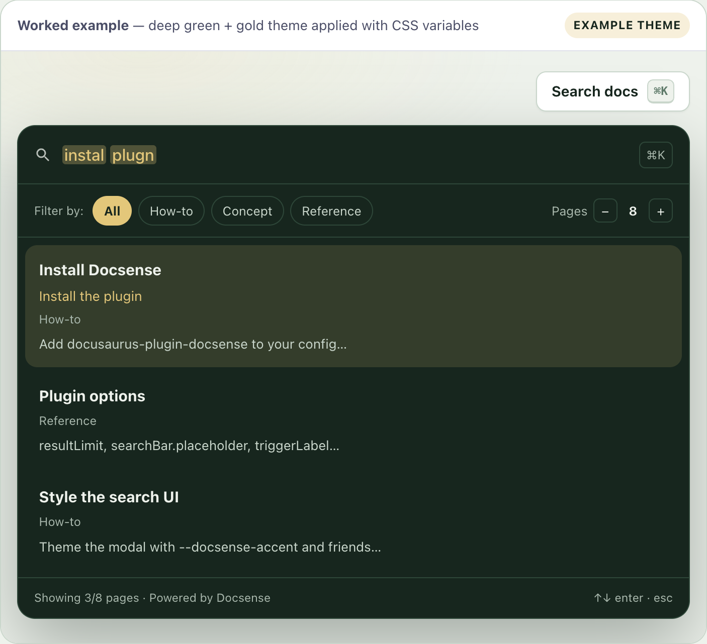
Worked example (what you are building)
The preview is a static mock of the SearchBar using the Docsense deep green + gold palette. Scroll the code section next to copy the same look onto your site.
- Install DocsenseInstall the pluginHow-toAdd docusaurus-plugin-docsense to your config…
- Plugin optionsReferenceresultLimit, searchBar.placeholder, triggerLabel…
- Style the search UIHow-toTheme the modal with --docsense-accent and friends…
 Docsense↑↓ enter · esc
Press ⌘K / Ctrl+K on this site. The live bar uses the same brand tokens from src/css/custom.css. The preview above is the teaching example so you can see the result even if the navbar is closed.
Copy this CSS
Put this in src/css/custom.css (or any stylesheet loaded by Docusaurus).
- Deep green + gold (this example)
- Pill trigger (minimal)
:root {
  /* Brand: deep green system + gold accent */
  --docsense-accent: #e3c77a;
  --docsense-accent-contrast: #17261e;

  --docsense-trigger-bg: #ffffff;
  --docsense-trigger-border: #c9d6cb;
  --docsense-trigger-color: #17261e;
  --docsense-trigger-radius: 999px;
  --docsense-trigger-padding: 0.45rem 0.95rem;

  /* Dark product modal: set fg/muted/border so text stays readable */
  --docsense-modal-width: 720px;
  --docsense-modal-radius: 16px;
  --docsense-modal-bg: #17261e;
  --docsense-modal-fg: #eef2ec;
  --docsense-modal-muted: #a9b8ad;
  --docsense-modal-border: #2e4739;
  --docsense-overlay: rgba(23, 38, 30, 0.55);

  --docsense-mark-bg: #e3c77a;
  --docsense-mark-color: #17261e;
}

[data-theme='dark'] {
  --docsense-trigger-bg: #1e3328;
  --docsense-trigger-border: #2e4739;
  --docsense-trigger-color: #eef2ec;
  --docsense-modal-bg: #17261e;
  --docsense-modal-fg: #eef2ec;
  --docsense-modal-muted: #a9b8ad;
  --docsense-modal-border: #2e4739;
  --docsense-overlay: rgba(13, 15, 34, 0.72);
  --docsense-mark-bg: rgba(227, 199, 122, 0.55);
  --docsense-mark-color: #eef2ec;
}

/* Optional polish */
.docsense-trigger {
  font-weight: 600;
  box-shadow: 0 1px 2px rgba(23, 38, 30, 0.08);
}

.docsense-trigger:hover {
  box-shadow: 0 0 0 3px rgba(227, 199, 122, 0.35);
}
:root {
  --docsense-accent: #0f766e;
  --docsense-accent-contrast: #ffffff;
  --docsense-trigger-radius: 999px;
  --docsense-modal-radius: 16px;
  --docsense-modal-width: 680px;
}
What each variable controls
| Variable | What changes in the UI |
|---|---|
--docsense-accent | Active filter chip, row hover, focus accents |
--docsense-accent-contrast | Text on accent backgrounds |
--docsense-trigger-bg / border / color | Navbar Search docs button |
--docsense-trigger-radius | Button corners (default 999px pill) |
--docsense-modal-bg | Modal background |
--docsense-modal-fg | Modal primary text (titles, input, chips) |
--docsense-modal-muted | Secondary text (snippets, footer, labels) |
--docsense-modal-border | Dividers and chip outlines |
--docsense-modal-width / radius | Modal size and corners |
--docsense-overlay | Dimmed backdrop |
--docsense-mark-bg / color | Highlights on the destination page after a click |
If you set a dark --docsense-modal-bg, you must also set --docsense-modal-fg (and ideally --docsense-modal-muted / --docsense-modal-border). Otherwise the site’s light-mode body text color can paint dark text on a dark modal and results look empty.
Wire the stylesheet
presets: [
  [
    'classic',
    {
      theme: {
        customCss: './src/css/custom.css',
      },
    },
  ],
],
Changing copy (placeholder, trigger label, shortcut) is done in plugin options. See Customize the search bar. This page is only about look and feel.
Destination-page marks
After a result click, matching terms can be wrapped in <mark class="docsense-mark">. Style them with --docsense-mark-bg and --docsense-mark-color as in the example.
See Highlight terms on the page.
Full variable list
See CSS variables.
Next steps
- CSS variables - Complete token reference.
- Customize the search bar - Labels, shortcut, and empty-state copy.
- Highlight terms on the page - Destination-page marks after a result click.
- FAQ - Common product questions.